A catalogue usually fails long before it goes to print. The problem is rarely the paper stock or the cover finish. It starts when a business tries to squeeze too many products, mixed messages and half-ready data into a layout and hopes design will sort it out. Good product catalogue design that Australian businesses can actually use comes from clearer thinking earlier in the process - what you sell, who it is for, how people compare options, and what needs to happen next. graphic-design-print - see how we can help.
For Australian SMEs, catalogues still do real work. They support sales teams, back up trade conversations, help distributors, sit in showrooms, and give buyers something more reliable than a messy spreadsheet or a stale PDF. They also need to hold up across print and digital use, which changes how they should be designed.
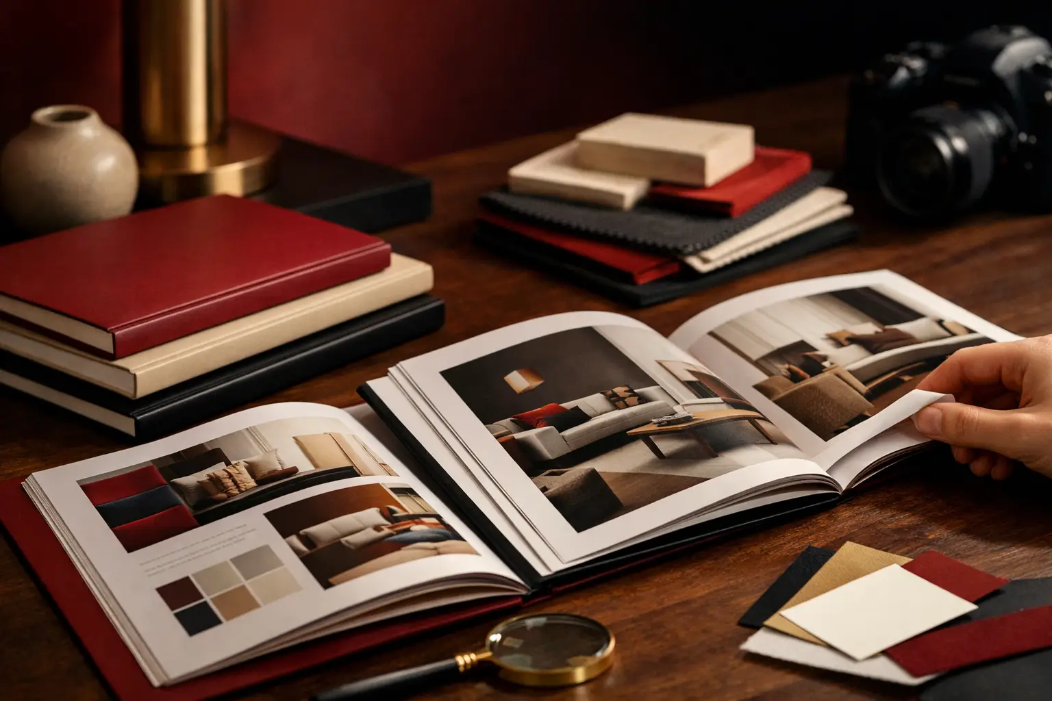
What good product catalogue design in Australia actually needs to do
A catalogue is not just a stack of product pages. It is a sales tool. That sounds obvious, but a lot of catalogues are designed as if the goal is simply to make everything fit.
Done properly, a catalogue helps buyers find what they need quickly, understand the differences between products, trust the brand, and take action. Sometimes that action is placing an order. Sometimes it is contacting a rep, requesting pricing, or shortlisting products for a project. The design has to support that outcome.
This is where many businesses get caught. A visually polished catalogue can still be hard to use. If product categories are unclear, specs are inconsistent, and imagery does not match the level of the brand, buyers work harder than they should. In practice, that means lower engagement, more sales friction, and more back-and-forth with your team.
Why catalogue design goes wrong
Most catalogue issues are structural, not cosmetic. Businesses often come to the design stage with content that has grown over time rather than been planned properly. Product names vary from one page to the next. Technical specifications are incomplete. Image files are inconsistent. Some products need comparison tables, others need application photos, and nobody has decided what format each page type should follow.
Then there is the internal politics of it. Sales wants everything included. Operations wants accuracy. Marketing wants the brand to look more established. Leadership wants it done quickly. All reasonable goals, but if nobody makes clear decisions, the catalogue becomes bloated and harder to use.
That is why a strong process matters. Not agency theatre. Just sensible planning, plain English decisions, and someone senior enough to say what should stay, what should go, and how the final piece needs to function.
Product catalogue design projects for Australian businesses need local practicalities considered
Product catalogue design that Australian businesses commission often has a few local realities that should be built in from the start. Page sizing, print runs, freight, local printers, turnaround times, and whether the piece will be mailed, handed out by reps, or downloaded as a PDF all affect the design.
A catalogue for a national wholesaler with a field sales team is not the same as a boutique product book for a showroom. A mining supplier, a food manufacturer and a furniture business all need different levels of specification, photography and category logic. There is no single best format. It depends on how your customers buy.
Australian businesses also tend to use catalogues across multiple channels. One file might be printed in bulk, sent as a downloadable PDF, split into smaller sections for email, or repurposed into web content. If that reuse is likely, the design should be built with that in mind. Otherwise, you end up paying twice - once for the catalogue, and again to rebuild the same information elsewhere.
The difference between a brochure and a catalogue
This matters more than people think. A brochure usually sells the business or a service. A catalogue helps people choose between products. That means the information hierarchy is different.
Brochures can be more narrative. Catalogues need stronger systems. You need consistent product blocks, repeatable layouts, clear section breaks, and enough restraint that readers do not get lost. Brand expression still matters, but not at the expense of usability.
If every spread looks different, the catalogue may win design points and lose commercial value. Familiar structure helps readers scan. That is what makes a catalogue easier to use in the real world, especially for time-poor buyers comparing options quickly.
What to get right before design starts
The fastest way to improve the final result is to sort the content before the layout phase. That includes product names, descriptions, SKUs, pricing logic if relevant, dimensions, material details, compliance information, and image selection. You do not need every word perfect on day one, but you do need a structure.
It also helps to define the page types early. For example, you may need category openers, standard product pages, technical comparison pages, feature spreads, and back matter such as ordering information or terms. Once those components are clear, the design becomes more efficient and more consistent.
Photography is another make-or-break factor. If your imagery ranges from polished studio shots to mobile photos grabbed from old folders, the whole catalogue will feel uneven. Sometimes that means commissioning new photography. Sometimes it means being selective and using fewer images more strategically. Either way, design cannot fully compensate for poor visual assets.
Design choices that actually improve results
The best catalogue design decisions are often the least flashy. Clear typography. Strong spacing. Honest hierarchy. Enough white space to let products breathe. A grid system that keeps pages consistent without making them rigid.
Navigation is especially important in longer catalogues. Readers should be able to move through sections without thinking too hard. Tabs, colour coding, running headers, page references and contents pages all help if used properly. If they are added as decoration rather than navigation, they just create clutter.
Comparison is another area where design earns its keep. If customers need to weigh up variants, dimensions, capacities or finishes, the information should be easy to scan. Tables can help, but only when they are set up cleanly. Dense, tiny type squeezed into a page is not useful, even if technically everything fits.
Calls to action matter too. Not every catalogue needs aggressive sales language, but readers should know what to do next. That might be contacting your team, visiting a showroom, requesting trade pricing, or quoting a product code. The path should be obvious.
Print, PDF, or both?
Usually both. That changes production requirements.
For print, you need proper bleed, colour setup, resolution, pagination and press-ready files. Stock choice, binding and finish affect not only how the catalogue looks but how durable and practical it is. A premium stock can lift perception, but if the catalogue is handled heavily by reps or used on-site, durability may matter more than a fancy finish.
For digital use, file size becomes part of the user experience. A beautiful PDF that takes ages to download is annoying. Interactive features can help, but only if they are compatible and reliable. It is often better to keep the digital version straightforward and accessible rather than over-engineered.
If the content also needs to feed a website, ecommerce platform or internal system, build that into the project from the start. The smartest catalogue jobs are not isolated design exercises. They connect with how the business already operates.
Choosing the right studio for product catalogue design in Australia
If you are comparing providers, look beyond the visuals. Ask how they handle content planning, image preparation, product data consistency, print production and file delivery. Ask whether the person selling the job is actually doing the work. That matters when timelines are tight and the content is messy.
A catalogue project can get technical quickly. It helps to work with a studio that understands brand, layout, print production and digital carry-through, not just surface-level styling. That is especially useful when your catalogue needs to align with a website refresh, a wider rebrand, or a broader set of sales collateral.
For businesses that want it done properly, the value is not just in a nicer document. It is in having a catalogue that is easier to update, easier to use, and more credible in front of customers. That is the difference between design that looks good in a presentation and design that works once it leaves the office.
Lovely Pixel approaches this kind of work with that practical lens - clear structure, direct communication, and no agency runaround.
A good catalogue should make your sales process simpler, not more complicated. If you are rebuilding one, start with the information, not the decoration, and you will get a result that holds up far better in the real world.
Need print artwork your supplier can actually use?
Brochures, catalogues, signage and campaign collateral - press-ready, colour-managed and on-brand.