
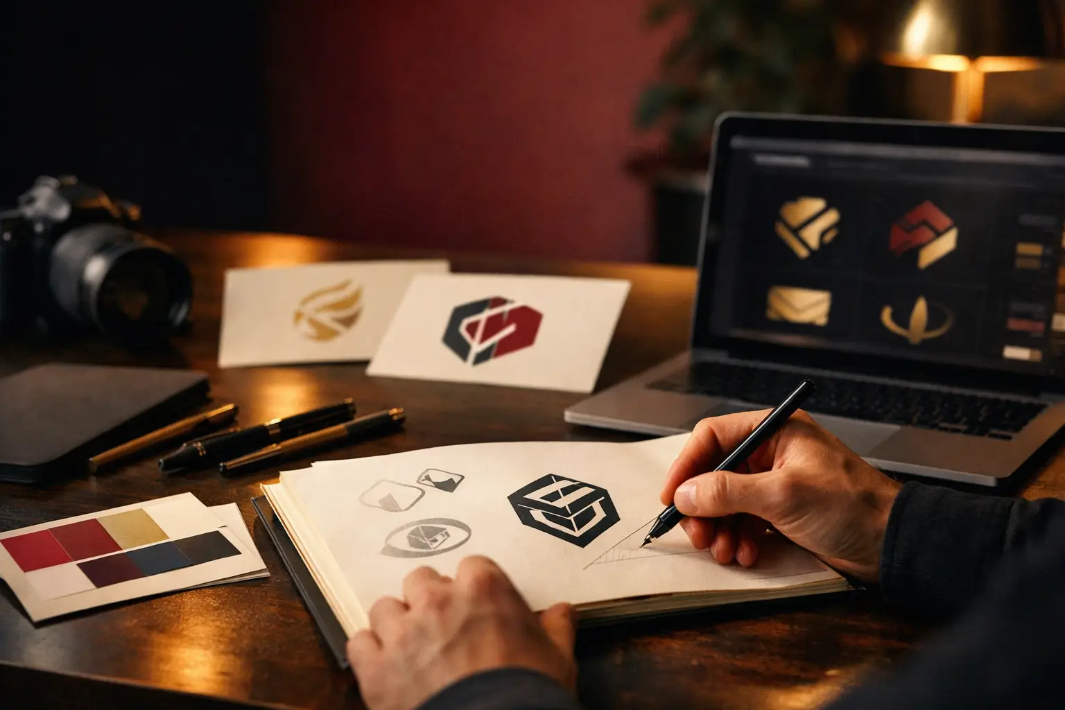
An established business already has equity in its mark, so the question is not whether the logo looks dated but whether it still works. A logo here has to be recognisable, practical across every application, and commercially aligned. Deciding between a redesign and a refresh is usually the real decision.
- The differenceYou already have recognition to protect
- A dated logoIs not automatically a bad logo
- It must beRecognisable, practical and commercially aligned
- The real decisionRedesign or refresh, and there is no automatic answer
- The processPractical, not weeks of workshops producing sticky notes
- DeliverablesMore than a couple of artwork files
If your business has been operating for years, your logo is not just a graphic on the website header. It is on signage, proposals, uniforms, vehicles, packaging, social tiles, stationery, presentations and probably a few things no one has audited in a while. That is why logo design for established business is a very different job from creating a logo for a startup. The stakes are higher, the rollout is broader, and the wrong decision costs more than a few awkward Instagram posts.
For established businesses, a logo project is usually not about chasing something trendier. It is about fixing a mismatch. Maybe the business has grown up but the branding still looks improvised. Maybe the logo only works in one format, falls apart at small sizes, or feels inconsistent across print and digital. Sometimes the issue is more commercial than aesthetic - the brand no longer reflects the quality of the work, the scale of the operation, or the markets the business wants to win.
Why logo design for established business is different
An established business already has equity in the market. Customers recognise the name. Staff are used to the materials. Sales teams rely on existing documents and signage. That means a logo redesign cannot be treated like a blank-sheet creative exercise.
The first question is not, what would look nice? It is, what is working now, what is limiting the business, and what needs to stay recognisable? In some cases, a full redesign makes sense. In others, the smarter move is a refinement - cleaner typography, a better symbol, improved spacing, stronger colour control, and versions that actually work across real-world applications.
This is where experience matters. If a designer only thinks in terms of the hero logo on a white background, they miss the practical reality. A logo has to reproduce properly on a shopfront, a PDF proposal, a social avatar, embroidered uniforms, a pull-up banner and a mobile screen. If it fails in any of those settings, the business ends up with workarounds, inconsistency and a brand that feels less established than it should.
Signs your current logo is holding the business back
A dated logo is not automatically a bad logo. Some marks hold up for decades. The issue is whether it still does the job.
If your logo looks amateur next to competitors, that matters. If your website has improved but the logo still makes the business feel smaller than it is, that matters too. The same goes for logos that are overly detailed, hard to reproduce, unclear at small sizes, or tied to design trends that have already passed.
Another common problem is fragmentation. Over time, businesses often end up with multiple versions of the logo floating around. One file used by the printer, another used on email signatures, a stretched version on signage, an old EPS in someone else's Dropbox, and no one quite sure which one is current. That is not just untidy. It slows down production, creates inconsistency, and makes the brand feel less credible.
There is also the internal side. If staff avoid using brand assets because they are hard to find or painful to apply, your identity system is not working. Good logo design should reduce friction, not create it.
What a strong logo needs to do now
A logo for an established business needs to be recognisable, practical and commercially aligned. It should reflect the level the business operates at, not the level it was at ten years ago.
That does not always mean more minimal. It means more deliberate. The typography should feel considered. The proportions should be balanced. The logo should have clear hierarchy and enough flexibility to work across horizontal, stacked and icon-led formats where needed.
Most importantly, it should be built as part of a broader identity system. A standalone logo file is not enough for a business with multiple touchpoints. You need colour specifications, type choices, spacing rules, file formats, and guidance for using the logo across print and digital. Otherwise, even a well-designed mark gets diluted by inconsistent application.
Redesign or refresh?
This is usually the biggest decision in logo design for established business, and there is no automatic right answer.
A refresh makes sense when the business already has decent recognition but the current logo needs technical improvement or visual refinement. You keep enough continuity to avoid confusing the market, while fixing the issues that make the brand feel old or inconsistent.
A full redesign is more appropriate when the business has changed direction, merged services, moved upmarket, entered new regions, or outgrown an identity that was never done properly in the first place. If the current logo actively undermines trust, preserving it for nostalgia is rarely a good strategy.
The trade-off is simple. A refresh is lower risk and often easier to roll out. A redesign can create a bigger shift in perception, but only if it is supported by the rest of the brand, website and collateral. Changing the logo alone will not solve deeper presentation problems.
The process should be practical, not theatrical
Established businesses do not need weeks of vague brand workshops that produce lots of sticky notes and not much clarity. They need a process that gets to the point.
That usually starts with an audit. Where is the current logo used? What problems show up in print, on the website, in proposals, on signage and in social formats? What should carry through, and what should be retired? From there, the project needs clear criteria: audience, market position, technical requirements, reproduction needs, and rollout priorities.
Concept development matters, but so does testing. It is one thing for a logo to look good in a presentation. It is another for it to hold up on a dark background, in a tiny favicon, in black only, or across a large format print file. This is where hands-on execution makes a real difference. A studio that understands both brand identity and production can spot issues early, before they become expensive.
For businesses with broader operational needs, the logo should also sit comfortably within the wider system. If a website redesign, signage update, brochure suite or internal template rollout is coming next, those dependencies should be considered upfront. That is often the difference between a rebrand that feels organised and one that drifts for months.
What to expect from the deliverables
A professional logo project for an established business should end with more than a couple of artwork files emailed over at the end.
You should expect a primary logo, alternate versions where required, icon or symbol variations if relevant, and file formats suitable for both print and digital use. You should also have usage guidance that explains spacing, colour, minimum sizes and incorrect applications. If the business relies heavily on printed collateral, signage or packaging, press-ready outputs matter as much as screen-ready ones.
This is where a lot of cheaper logo work falls short. It may produce something visually acceptable, but not something operationally useful. If the files are messy, missing, or unsuitable for production, the business ends up paying again later through rework, printing issues or inconsistent branding.
The cost question, honestly answered
Businesses often ask why logo work for an established company costs more than a basic logo package advertised online. The answer is scope, risk and implementation.
A logo for an established business has more dependencies. There is more to assess, more to preserve, more to test and more to roll out. You are not only paying for visual ideas. You are paying for judgement, production awareness and a result that can be applied properly across the business.
That does not mean the most expensive option is automatically the best. It means the cheapest option is often cheap because it ignores the hard parts. If your business relies on credibility, consistency and practical execution, those hard parts are the job.
For many SMEs, the smartest investment is not a flashy rebrand campaign. It is a logo and identity system done properly, with direct communication, realistic scope and assets that the team can actually use. That is one reason studios like Lovely Pixel tend to work well for growing businesses - there is less theatre, more accountability, and the person doing the work understands both design and delivery.
A good logo should make the rest of the business easier
The best outcome is not just a better-looking mark. It is a brand asset that removes friction. Your website feels more credible. Your proposals look sharper. Your signage is consistent. Your team stops improvising. Your suppliers get the right files the first time.
That is the real value of logo design for established business. It should support sales, presentation and day-to-day operations without creating extra complexity. And if your current logo is making the business look less capable than it really is, fixing that is not vanity. It is overdue.
Need a brand identity that holds together everywhere?
Identity systems and rollout assets for websites, print, signage, templates and everyday marketing.