LUMINOUS Lantern Parade: Multi-Format Event Campaign in Queensland
A multi-format campaign for LUMINOUS Lantern Parade - described by Multicultural Australia as Queensland's largest parade celebrating cultural diversity. Lovely Pixel developed the event poster, postcards, cinema commercial and television commercial across multiple years, building one campaign identity that worked from a printed postcard handed out at a community event through to a TV spot on broadcast television.
Overview
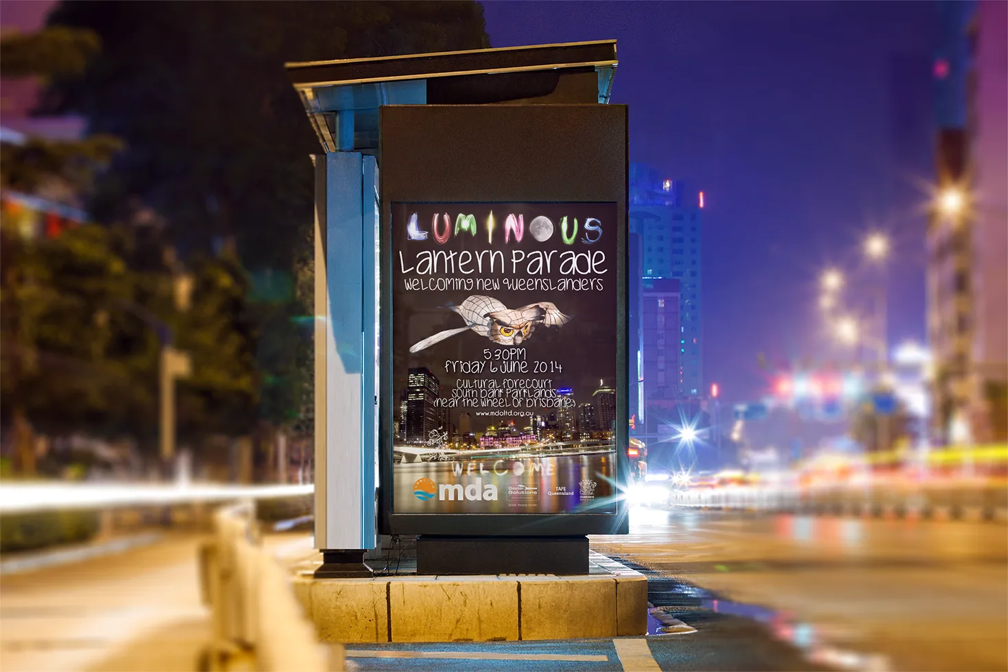
LUMINOUS Lantern Parade is one of the most-loved community events on the Queensland calendar - a public lantern parade through South Bank Parklands designed to welcome new Queenslanders and celebrate cultural diversity. Public coverage describes the event as a major celebration where Queenslanders come together to welcome people who have recently arrived from around the world, and Multicultural Australia later described LUMINOUS as Queensland's largest parade celebrating cultural diversity.
Lovely Pixel developed the campaign identity and creative across print, cinema and television formats. The brief required a single visual system that could carry the magic of a night-time lantern parade - glowing, communal, cinematic - and still hold up as a working event poster, a postcard hand-out and a paid television commercial.
The brief and the challenge
Event campaigns are usually designed format-by-format - a poster designer makes a poster, a video team makes the commercial, and the brand looks slightly different in each. The LUMINOUS brief did the opposite: every format had to feel like the same campaign, even though the production realities of a printed poster, a cinema ad and a TV spot are completely different.
The creative also had to capture an emotional, atmospheric event. Lantern parades are about light, movement, public participation and community. A flat event flyer would have failed the brief. The design needed to feel like an invitation to take part in a shared public moment.
The approach
The visual direction centred on the idea of light as welcome. The poster used a night-time Brisbane atmosphere, glowing lantern imagery, hand-rendered typography and warm illuminated details to create anticipation. The owl lantern motif became a strong focal element - magical, theatrical and connected to the physical lantern parade.
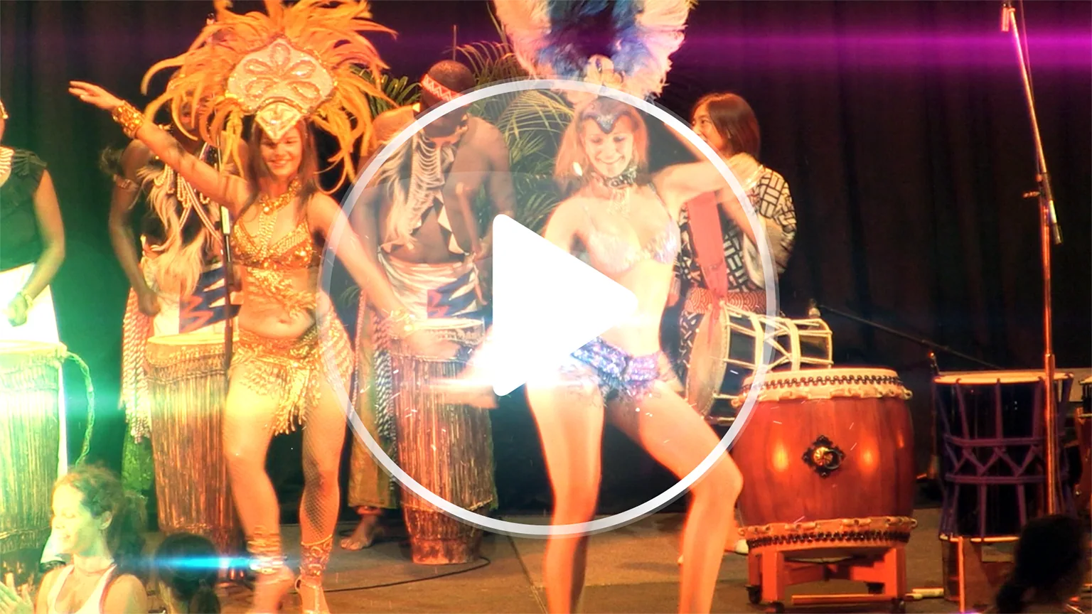
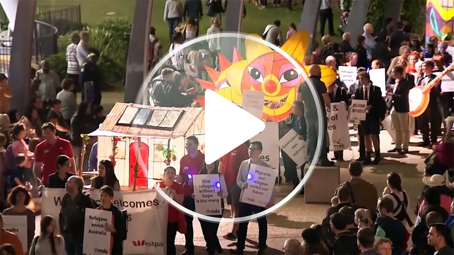
Cinema and TV commercials extended that same visual language into motion - lanterns moving through crowds, multicultural performance, night-time atmosphere, community participation. The campaign system kept its identity intact whether someone first saw it on a postcard at a community event or on a TV ad before the news.
- Event poster design (large-format, print-ready)
- Promotional postcard design for community and venue distribution
- Cinema commercial - broadcast-spec creative for pre-feature screens
- Television commercial - broadcast-spec creative
- Cross-format campaign visual direction and art direction
- Print-ready artwork supplied to printer with bleed, marks and colour notes
Project gallery
Designing across print and broadcast in one system
Posters and television commercials are usually treated as different problems by different studios. This campaign treated them as one design problem with different output formats - which meant the cinema and TV spots reinforced the poster, the postcards reinforced both, and people seeing the campaign at four different touchpoints in a week saw one consistent identity instead of four lookalikes.
That cross-format discipline is the same one we bring to commercial brand identity and graphic design and print projects - making sure a business doesn't look like one studio designed its logo, a different studio designed its brochures, and a third designed its signage.
Why this matters as a credibility signal
Event campaigns are a high-pressure test of design system thinking. They have hard public deadlines, real budgets, mixed media, and a non-negotiable launch date. Surviving that with the identity intact across every format is the same skill set we bring to commercial logo design, Brisbane brand identity design and print design engagements.
Outcome
The LUMINOUS campaign gave MDA / Multicultural Development Australia a strong visual and promotional identity for one of Queensland's most visible multicultural events. The creative successfully translated the event's core themes - welcome, light, movement, diversity and community - into a campaign system that worked across print, cinema and television.
For Lovely Pixel, the project remains a strong example of event campaign design, poster design, postcard design, cinema advertising, television commercial production support and multicultural community marketing - delivered as a single connected system rather than four separate pieces of work.
Skills and capability
Need a campaign that works in print and on screen?
Posters, cinema ads, social cuts, TV spots - designed as one system, not bolted together at the end.