Brisbane Sign - Letter A artwork case study
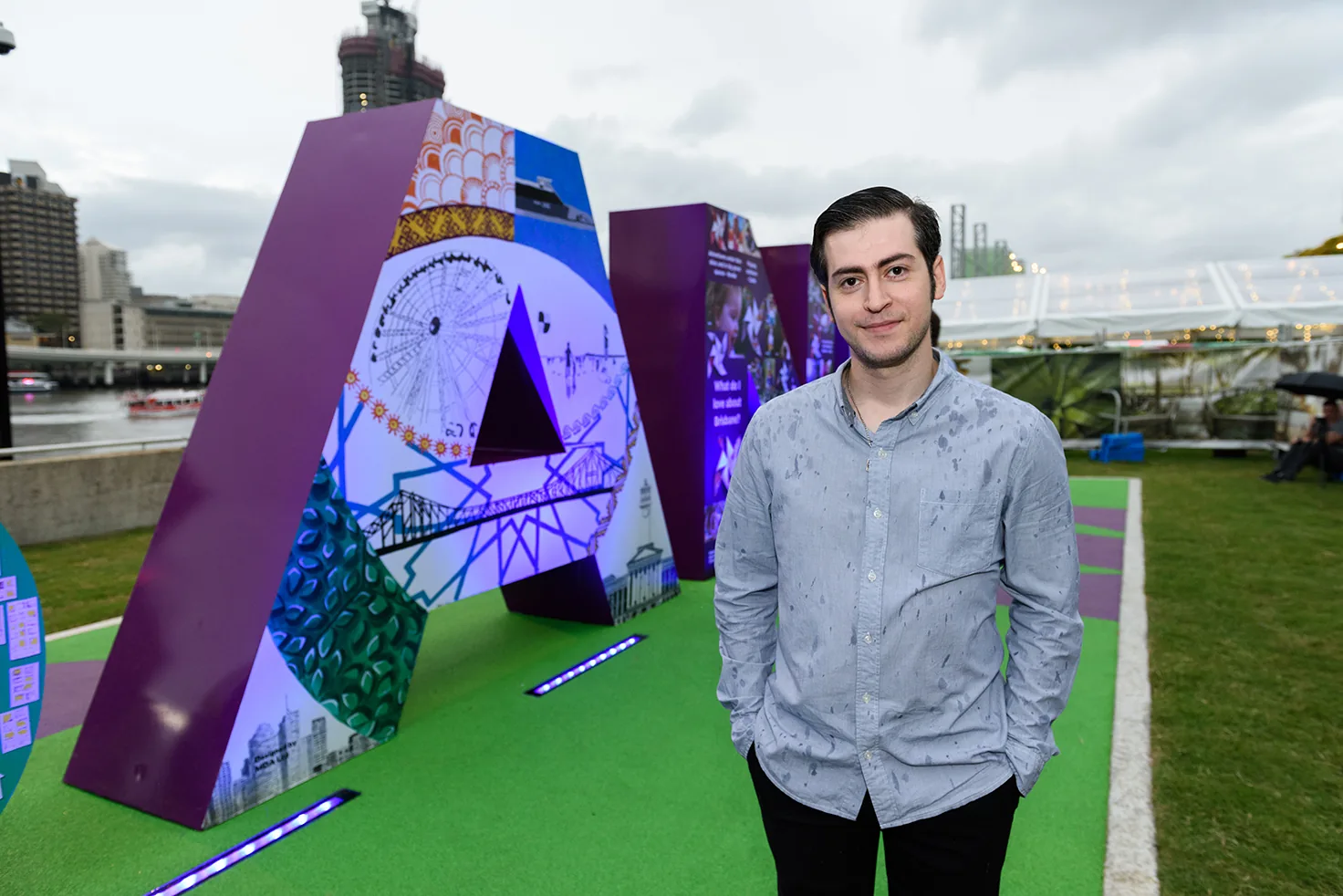
A large-scale public artwork created for the original BRISBANE sign at South Bank, designed as part of Brisbane's G20-era cultural celebrations. Lovely Pixel designed the Letter A - a layered visual composition built around Brisbane landmarks, cultural patterning and civic energy - sitting within one of the city's most photographed public installations beside the Brisbane River.
Brisbane Sign Letter A project overview
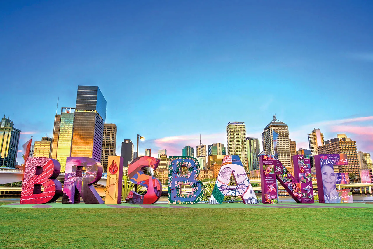
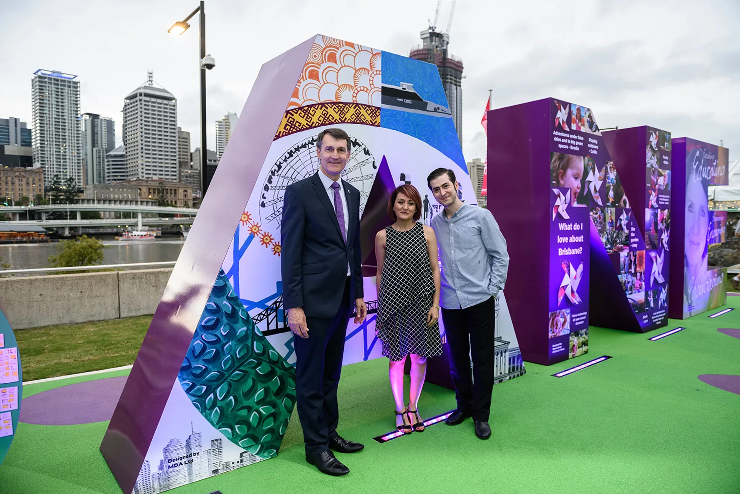
The Brisbane Sign - Letter A was a public art and environmental graphic design project created as part of the original BRISBANE sign installation at South Bank. The sign was developed during Brisbane's G20-era cultural celebrations as a bold visual welcome point for the city - a place where locals, visitors, delegates and tourists could gather, photograph the city skyline, and connect with Brisbane's identity.
Each letter of the wordmark was designed by a different contributor. The Letter A had to sit confidently within that collective wordmark while still holding its own identity at architectural scale. The final design became part of a highly photographed civic landmark positioned beside the Brisbane River, with the city skyline as its backdrop.
The brief and the challenge
Designing for a public landmark is fundamentally different from designing for a screen or a printed page. The Letter A had to be visually striking from a distance, detailed enough to reward close viewing, meaningful enough to represent Brisbane's character, and balanced enough to sit alongside other letters created by different community groups - without competing with them.
The project also carried additional pressure because the sign was connected to the G20 Leaders' Summit, one of the most internationally visible events Brisbane has ever hosted. Get a letter wrong and it shows up in every photograph of the city for weeks.
The approach
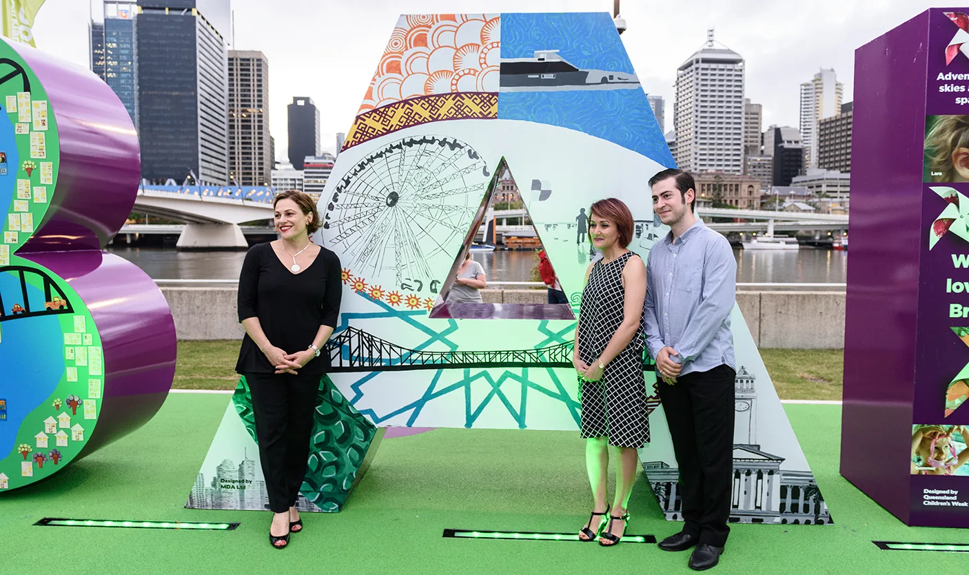
The artwork was built as a layered visual composition combining Brisbane landmarks - the Wheel of Brisbane, bridge structures, city buildings, river transport - with bold colour blocks and cultural patterning. The geometry of the letter A itself was used as a structural canvas: rather than treating the letter as a flat surface, the design worked with its triangular form, using different zones to create contrast, balance and flow.
The goal was civic rather than touristic - to make a public artwork that felt alive and represented Brisbane as welcoming, multicultural, creative and connected, not a literal tourism poster.
- Research into the broader sign concept and neighbouring letters
- Multiple concept explorations and refinement rounds
- Layered illustration combining landmarks, cultural patterning and architectural linework
- Final delivery in production-ready format for fabrication and installation
- Composition designed for both distant viewing and close-up engagement
Project gallery
A public landmark that outlived its original brief
The BRISBANE sign quickly became more than a temporary event installation. Brisbane Lord Mayor Graham Quirk described the sign's social media reach as something that sent Brisbane "back around the globe", highlighting its value as a tourism and city-branding asset. The original temporary version was only intended to remain for a short period; its popularity led to a more durable permanent version being installed at South Bank, where Visit Brisbane today describes it as a popular place for visitors to take group photos and selfies with the Brisbane skyline behind them.
Typography and detail at public scale
Public signage design isn't about a single clever idea - it's about execution at scale. Curve tension, optical spacing, weight at distance, and how a form reads when traffic is moving past it are all decisions that have to be made deliberately. The work here is restrained on purpose: the job is to sit well inside a wider composition, not to shout over it.
Designs that sit in public have to survive production realities - large-format fabrication tolerances, viewing angles, weather, and the fact that you can't ship a patch once it's up. The design was supplied to production-ready specs with clean vector geometry, considered stroke weights and file hygiene so the fabricator's life was easy, not hard.
Brisbane graphic design proof at public scale
For Brisbane businesses sizing up a design studio, the BRISBANE sign is the kind of project most agencies never get near. It sits at the intersection of graphic design Brisbane, brand identity Brisbane and large-format signage design - a single artwork that had to perform as illustration, typography and place identity at architectural scale.
The same discipline carries straight into commercial work: a logo system that survives across a shopfront, a vehicle wrap and a website; a brand identity that holds up under everyday production, not just on a hero shot. Whether the brief is print design Brisbane for a brochure or catalogue, or a small business logo and visual identity, the bar is the same - get the geometry, hierarchy and production specs right the first time.
Why this matters as a credibility signal
This case study isn't a full brand rollout - it's a credibility signal. The same detail and restraint go into every logo, brand identity and asset we ship for clients, whether it ends up on a shopfront, a van or a website. The discipline that survives a permanent civic installation is the same one we bring to commercial brand identity Brisbane and graphic design Brisbane projects.
Outcome
The Letter A became part of one of Brisbane's most recognisable public installations - a piece of design that operated at civic scale, within a public environment, and as part of a high-visibility cultural project. The work demonstrated that creative design can extend beyond conventional digital and print formats into civic identity, place-based storytelling and tourism value.
For Lovely Pixel, the project remains a strong example of the kind of considered, restrained, system-aware work we bring to every brand, identity and design engagement, whether the final output is a hoarding poster or a city landmark.
Skills and capability
Want Brisbane design work with this level of care?
Tell us what you want customers to feel when they see your brand - we'll take it from there.