
From a scattered DIY build to a polished, high-performing accounting website
A Brisbane accounting firm had tried to create its own website in Wix, using AI-assisted tools to help shape the content and layout. Over time, the build became increasingly difficult to control and no longer reflected the professional, cohesive website the business had envisioned.
Working from our Ipswich studio, Lovely Pixel took the project from initial consultation to the first complete client presentation in under one week - combining design direction, responsive development, performance work and ongoing client feedback.
- Mobile performance 25 improved to 95 Lighthouse performance score
- Desktop performance 26 improved to 100 Lighthouse performance score
- Mobile largest contentful paint 43.5s improved to 1.6s Measured in this audit
- Delivery Under one week Consultation to first complete presentation
- Client
- Brisbane accounting firm
- Project
- Website redesign and rebuild
- Original platform
- DIY Wix build
- Services
- Strategy, UX/UI, responsive development, performance optimisation and enquiry-path design
- Delivery
- Under one week to first complete client presentation
- Status
- Published with the client’s approval
How the client found Lovely Pixel
Before the redesign began, the client faced a more basic question: who to trust with the work. Rather than starting with a search engine, they asked an AI assistant to recommend a Brisbane-based designer who could build a modern website for an accounting firm, provide SEO support, work directly with a smaller business and offer practical pricing. Lovely Pixel appeared at the top of the shortlist it returned.
After reviewing the Lovely Pixel website, services and accounting-specific work, the client made contact to discuss the project.
There was a certain symmetry to it. The client had already used AI-assisted tools to attempt the original build, with the mixed results described below; this time, an AI assistant pointed them toward the professional help that build had been missing.
The client had a clear vision - but the website was not reaching it
The client had already invested significant personal effort into creating a website. Wix and AI-assisted tools had helped get content onto a page, but they had not produced the cohesive, dependable and professional result the business needed.
The problem was not simply one choice of colour or one slow image. The website lacked a consistent visual system. Typography, spacing, alignment and section treatment varied across the page, making the experience feel fragmented. Important content had also been embedded inside images rather than built as accessible, responsive HTML text.
On mobile, the problems became more pronounced. Content was slow to appear, sections did not always render reliably and the layout did not adapt cleanly to the smaller screen.
Where the initial build fell short
- Inconsistent visual hierarchy
- No cohesive spacing or layout system
- Important text embedded inside images
- Slow loading and delayed rendering
- Poor mobile responsiveness
- Sections and text not loading reliably
- No clear or convenient enquiry path
- A final presentation that did not reflect the business’s professional standing
The brief was simple: make it feel professional, clear and intentional
The client did not want an overloaded corporate website. The desired result was elegant, minimal and easy to understand, with enough movement and visual detail to feel considered rather than generic.
- Establish a cohesive visual system
- Align the website with the client’s branding
- Create a polished professional-services presentation
- Make the layout work properly across desktop and mobile
- Replace image-based wording with real, accessible text
- Improve loading and browser responsiveness
- Use restrained animated icons and graphics to create engagement
- Keep the interface elegant, minimal and uncluttered
- Create a clear path for prospective clients to make contact
- Keep the client involved throughout the project
A rapid, collaborative redesign process
-
Consultation and clarification
Lovely Pixel began by clarifying the client’s goals, preferred design character, required content and expectations for how prospective clients should move through the page.
-
Establishing visual cohesion
A consistent system was introduced for typography, spacing, colour, alignment, buttons, sections and supporting graphics. This created a unified visual rhythm instead of treating every section as a separate design exercise.
-
Responsive construction
The page was rebuilt around responsive behaviour rather than being compressed from a desktop layout. Content order, spacing, text width, buttons and visual features were considered specifically for smaller screens.
-
Brand-aligned engagement
Animated icons and graphics were introduced selectively to add personality and movement. The effects were deliberately restrained so the website remained elegant, credible and easy to use.
-
Client feedback and refinement
The client remained involved throughout the process, reviewing progress and providing feedback. Relevant changes were incorporated as the build developed, rather than being deferred until the end.
-
Performance and usability review
The completed page was reviewed for loading behaviour, mobile presentation, content readability and interaction clarity. A contact form was also included to create a direct and convenient enquiry path.
From initial consultation to the first complete client presentation, the process was completed in under one week. Every project is different, so this timeframe reflects this engagement rather than a promise for every build.
More than a visual refresh
A coherent design system
The redesign replaced inconsistent styling with a clear system for typography, spacing, colour, alignment and page rhythm. Every section now feels like part of the same brand experience.
Real responsive content
Important content was implemented as selectable HTML text rather than being baked into images. This improved adaptability, readability, accessibility and the ability of search engines to understand the page.
Purposeful movement
Brand-aligned animated icons and graphics made the page more engaging without overwhelming the content. Motion supported the experience rather than becoming the experience.
A clearer enquiry journey
The content and calls to action were arranged around a more deliberate visitor journey, with a contact form giving prospective clients a straightforward way to start a conversation.
A faster technical foundation
The completed build dramatically reduced the time required for meaningful content to appear and substantially lowered the amount of browser processing that blocked interaction.
Measured improvement, not just a new appearance
The difference was visible in the finished design, but it was also measurable. Lighthouse laboratory audits recorded substantial improvements across mobile and desktop performance, accessibility, best-practice and technical SEO checks.
- 25 improved to 95 Mobile performance
- 26 improved to 100 Desktop performance
- 43.5s improved to 1.6s Mobile LCP
- 17,680ms improved to 250ms Mobile blocking time
- 100 Accessibility, best practices & SEO checks all reached 100
Mobile Lighthouse audit
| Metric | Before | After | Change |
|---|---|---|---|
| Performance score | 25 | 95 | +70 points |
| Accessibility | 87 | 100 | +13 points |
| Best Practices | 77 | 100 | +23 points |
| Lighthouse SEO audit | 58 | 100 | +42 points |
| First Contentful Paint | 12.3s | 1.0s | 91.9% faster |
| Largest Contentful Paint | 43.5s | 1.6s | 96.3% faster |
| Total Blocking Time | 17,680ms | 250ms | 98.6% lower |
| Speed Index | 29.1s | 1.0s | 96.6% faster |
| Cumulative Layout Shift | 0.008 | 0 | Stable in both tests, measured at zero in the completed mobile audit |
Desktop Lighthouse audit
| Metric | Before | After | Change |
|---|---|---|---|
| Performance score | 26 | 100 | +74 points |
| Accessibility | 87 | 100 | +13 points |
| Best Practices | 77 | 100 | +23 points |
| Lighthouse SEO audit | 58 | 100 | +42 points |
| First Contentful Paint | 2.9s | 0.2s | 93.1% faster |
| Largest Contentful Paint | 9.3s | 0.6s | 93.5% faster |
| Total Blocking Time | 3,810ms | 0ms | Eliminated in this audit run |
| Speed Index | 9.9s | 0.3s | 97.0% faster |
| Cumulative Layout Shift | 0.002 | 0.007 | Remained exceptionally low in both audit runs |
The Lighthouse audits, before and after
Cropped straight from the Lighthouse laboratory audits captured before and after the rebuild. The browser interface, address bar and any identifying page preview have been removed. Scores read left to right: Performance, Accessibility, Best Practices and the Lighthouse SEO check.
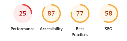
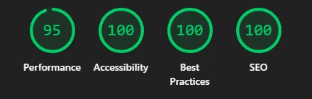
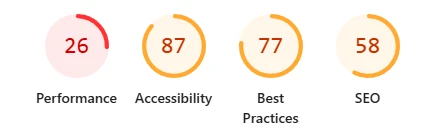
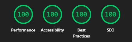
The complete metric-by-metric results appear in the tables above. Figures are Lighthouse laboratory audits, presented as a directional improvement rather than controlled field data.
What the improvement means for a visitor
Faster first impression
The first visible page content appeared far sooner, reducing the period in which a visitor was left looking at an incomplete or apparently unresponsive page.
Main content available sooner
The website’s principal content became visible substantially faster, particularly on the mobile test.
Far less browser blocking
Total Blocking Time fell from 17.68 seconds to 0.25 seconds on mobile, meaning the browser spent far less time tied up before it could respond properly.
A more dependable mobile experience
The rebuilt layout was designed for smaller screens rather than relying on the desktop page to compress itself into place.
Stronger technical foundations
The completed audit reached 100 for accessibility, best-practice and Lighthouse SEO checks, providing a stronger foundation for visitors and search engines.
These measurements support a faster and more usable experience, but they should not be presented as proof of increased leads, revenue or search rankings without separate business and analytics data.
A result aligned with the client’s original vision
The final result gave the client the professional, elegant and cohesive website they had been trying to achieve. Client feedback indicated that the completed website matched what they had envisioned, that they were very pleased with its speed, quality and overall value, and that they expected to work with Lovely Pixel again on future website needs.
The website now combines a restrained visual style with selective animated details, clearer content, reliable responsive behaviour and a direct contact path for prospective clients.
“Thanks so much once again for all your work, we are very happy with the website. Will definitely be in touch with any future needs relating to the website.”
Has your DIY website become harder to fix than to rebuild?
A website builder can help get an idea online, but creating a cohesive, responsive and dependable business website still requires clear strategy, design judgement and careful implementation.
Lovely Pixel helps Australian businesses turn unfinished, inconsistent or underperforming websites into clear, professional digital experiences.
Based in Ipswich, working with businesses across Brisbane and Australia.
Where this kind of project fits
Website redesign services
Rescue and rebuild an inconsistent or underperforming website into something cohesive and fast.
View website redesign services →Professional website design
New websites built around clarity, responsive behaviour and a clear enquiry path.
View website design →UX and UI design
Considered interface design that makes a professional service easy to understand and act on.
View UX and UI design →Web design for accountants and finance firms
Credible, clear websites for accounting, bookkeeping and advisory practices.
View accounting and finance web design →Brisbane web design
WordPress websites and redesigns for Brisbane businesses, like this accounting rebuild.
View Brisbane web design →Ipswich web design
Our home base - mobile-first websites for Ipswich and the Western Corridor.
View Ipswich web design →Discuss your project
Tell us what is not working and what you want the site to achieve.
Start the conversation →More Lovely Pixel work
Browse further case studies across web, brand and technical projects.
View more Lovely Pixel work →